Venice Biennale

Taking stock

image

On another art crawl around London with Paul Carey Kent. Paul’s walks are now so popular that sometimes twenty or more people are trailing after him (he walks fast) from one gallery to another (and in all, he is known and greeted warmly). These walks are not just a way to see what’s on in London, but also a way for artists and writers to meet and compare notes, look at things together and sometimes have a good old fashioned argument about what works and what doesn’t. Paul always plans the itinerary in advance, and today, we are covering Kings Cross, Old Street and Bloomsbury.

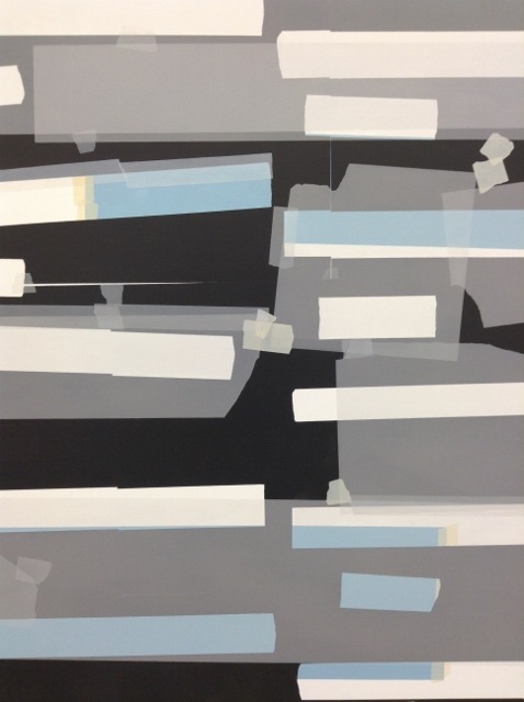
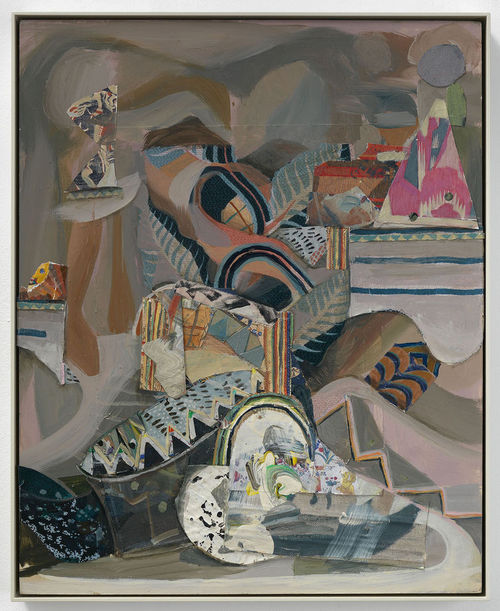
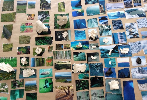
Next door to each other, in Victoria Miro and Parasol Unit respectively, are new shows from Sarah Sze and Katy Moran. A dialogue emerges between the two artists (women of roughly the same generation) centered around collecting and assembling. Although Moran’s work is on the surface more traditional, focused on painting, it’s what she crams into her small-scale canvases that is surprising. Her titles suggest the bright and kooky world of cartoons, circus, the world in all its variety, and they give a hint that the paintings are more than they appear. From a distance, they are densely patterned, energetic abstract swirls, but only when you get up close do you realize that they contain multilayered collaged bits from books and magazines, often masked or veiled by Moran’s brush. Figures emerge from the chaos of paint. Moran turns the canvas around while she’s working, so everything’s turned on its head, and there’s often no clear way in, we just need to follow her down the particular maze she leading us through. 


image


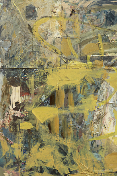
I saw her work first at Tate St Ives some years ago, and while I liked it then, the new paintings seem to be richer, more worked, more complex – the difference between early Pound and the Cantos. Like opening an attic door and peering into the darkness and clutter, knowing you will find treasure.

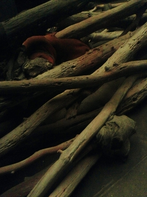
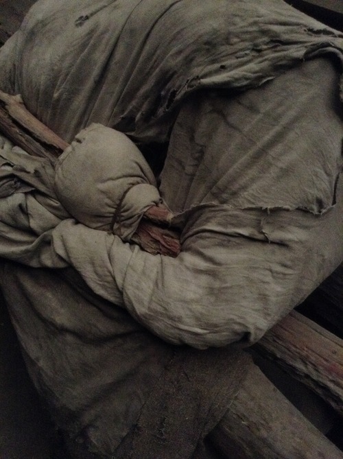
Although there are silkscreen prints in Sarah Sze’s show (not so successful for me), she is primarily a sculptor, or more accurately, a compiler of installations. I was impressed with her Venice Biennale show in 2013, when she turned the United States Pavilion into the lab of a mad scientist, the strange assemblage actually snaking its way out of the building.


image


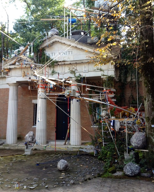
I loved the chaos and bustle, but also felt there was too much (and my photos capture certain individual elements I loved rather than trying to encompass the entire installation). 


image
image


Here at Victoria Miro, not everything works. The installation on the lower level seems without focus. The piece is called Still Life with Desk, and the individual elements don’t seem to add up to much, apart from maybe trying to get at what’s in the head of the artist or 
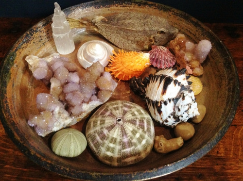
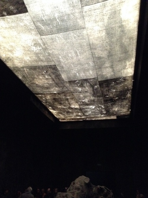
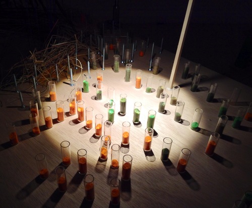
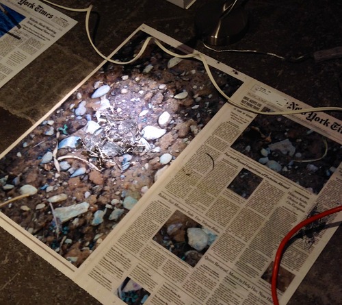
writer at the moment of creation. It’s the piece upstairs, Calendar Series, that impressed me and reminded me of the best moments of her Venice show.
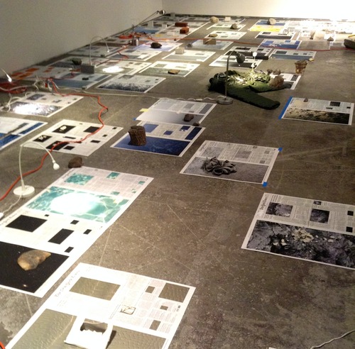

image


The floor is covered in front pages from The New York Times, spanning a period of months from July to October 2013. Sze has doctored the cover photographs, replaced them with images that appear to be from the natural and celestial worlds, created an assemblage of three-dimensional objects to match the photos. The pages is lit with a series of desk lamps, each casting a small pool of light over its chosen page in the darkened space. I think of labs, libraries, archives, places of study or research, the object of the research perhaps newsworthy, but odd in its isolation, its difficulty to categorise in any satisfactory manner.


image


I’ve focused on those two exhibitions in detail, but we also covered the extraordinary Richard Serra show at Gagosian http://www.gagosian.com/exhibitions/richard-serra–october-11-2014 the disturbingly beautiful sculptures of David Altmejd at Modern Art http://www.modernart.net/view.html?id=1,4,1260,1261 and the gorgeous ‘tapestries’ made from old bottle caps and bits of metal by El Anatsui at the October Gallery http://www.octobergallery.co.uk/exhibitions/2015els/index.shtml . All worth catching.

Landscape with fake dictionary

image

I’ve been trying to work out what it is I love about Antwerp. On one level, it’s like a fantasy, with its dark Medieval spires, cobbled streets and Netherlandish gargoyles crouching in the doorways of patrician stone buildings. There is something about scale as well; I know I’ve written here before of the charm of smaller cities, ones where the centre fits onto a single map and you feel you might be able to get the measure of the place in a few days.

It’s also very beautiful. We first meet the eponymous hero of Sebald’s Austerlitz as he is sketching the waiting room in the grand Centraal Station, and what follows is an amazing history of its construction:

when Belgium, a little patch of yellowish grey barely visible on the map of the world, spread its sphere of influence to the African continent with its colonial enterprises, when deals of huge proportions were done on the capital markets and raw-materials exchanges of Brussels, and the citizens of Belgium, full of boundless optimism, believed that their country, which had been subject so long to foreign rule and was divided and disunited in itself, was about to become a great new economic power. 

image

It’s where the novel begins, in that incredible vast bourgeois station, which lends drama and opulence to arrival. Something of that sense of spreading across continents remains too as you exit the station: the citizens of the dissolved empire are all around. The station is next door to the zoo – I can’t think of another major city where you would find such a juxtaposition, which strikes me somehow as very Belgian, or at least Flemish – the more I travel around Flanders, the more I get the Belgian sense of humour, which is a bit rude, a little surreal. I love the sound of Flemish, its guttural drama. So much less refined than French; a dirty joke would certainly sound better in Flemish (maybe that accounts for their bawdiness). Part of the beauty of Flemish for me is not understanding a word of it, allowing the sound to float over me like some discordant piece of music.

And so to Zeno X, and the new Mark Manders show. I discovered Manders’ work when he was representing the Netherlands at the 2013 Venice Biennale (he is Dutch, but has been based in Ghent for many years) and posted my impressions here at the time. Going to his show first, almost straight off the train, grounded me for the rest of the weekend. Manders’ project is about how we define ourselves in relation to our surroundings, so that many of the works are variations on the theme of self-portrait (the next day, I found myself thinking of Manders while staring at Van Eyke’s depictions of the great and the good of his day).

image

It’s an important consideration in a place like Belgium, where people move in and out of different languages – the most obvious shift being from Flemish to French. His work always seems to be in the process of being made, so nothing is ever quite finished, even once it appears within the pristine walls of the gallery. His piece, Landscape with Fake Dictionary, suggests this dilemma  of navigating a city where many different languages are being spoken, but you can’t understand any of them. It put me in mind of the ‘fake newspapers’ he created for his Biennale show – all real (English) words, but thrown together to create nonsense.

image

Fakes kept appearing after that, from Manders’ fellow Zeno X artist Kees Goudzwaard, and his trompe-l'œil paintings that appear to be held together by strips of tape – he constructs a model with tape and then meticulously paints strips that give the illusion of tape.

image

And then the many extraordinary still lives from the collection of the Royal Academy, which at the moment have found a temporary space in the seventeenth-century mansion of the former mayor, Nicholas Rockox. How exciting to find these paintings in the sort of setting they were made for – domestic and intimate. The curators have constructed cabinets of curiosities around the building, matching the painted still lives with assemblages of rocks and stones and glass.

image

A kind of fake – at the very least, highly theatrical but at home in a place that suits theatre, the evening light gilding the spire of Our Lady.

image

Cripplewood

image

I started my Biennale round-up with the Netherlands, and now I am moving to Belgium, the Netherlands’ neighbour, not just on the map, but in the microcosm of the world that is the Giardini – a small Low Countries coalition. And so I move from Mark Manders to Berlinde De Bruyckere. 

What links them for me, apart from the fact that they are of the same generation (and roughly the same age as I am) and that they both live and work in Belgium, is something to do with mood. For their respective installations, both artists are utilising found materials (there were a lot of found materials this year, as if artists are busily raiding junk shops and skips in the face of austerity), but these materials are transformed to represent something vast and wordless, a sense of failed promise, as we are presented with things that are broken, impossible to mend. 

De Bruyckere’s work often concentrates on the human – the body contorted, twisted into a shape which is not physically possible, but expresses the cry of suffering, like Francis Bacon in 3D. She is sometimes referencing the grim crucifixions of the Netherlandish Renaissance, or the Belgian battlefields of the first World War, but there is also something of the way we live now, often in terror and in fear. 

image

In De Bruyckere’s Biennale installation, there is a single massive felled elm tree that crowds the gallery floor, so huge it occupies the whole of the pavilion. Whereas the Scandinavian pavilions displayed trees that were standing, healthy and in growth, De Bruyckere’s tree appears dead, toppled to horizontal, with branches that look like broken and bleeding limbs, wrapped in hessian. The tree is ill, pale, it doesn’t feel solid; on closer inspection you realise it’s made of wax, as if it might melt into nothingness, its limbs are the colour of flesh. The pavilion is dark; De Bruyckere has blocked out the light with hessian sacks. No light can come in; this is a netherworld, a haunted forest. 

The first inspiration for the work came when the artist was driving through France after a storm and encountered a massive, uprooted tree in the road. De Bruyckere said that ‘the image came to mind of a collapsed cathedral, the roof vault thrown to the floor.’ 

image

The artist wrote to the South African novelist J.M. Coetzee about the tree. He in turn wrote the following piece for the show, a meditation on its name: 

Kreupelhout

Cripplewood is not deadwood. Deadwood: in the mythology of the American West, the town of failed hopes where all trails end. Cripplewood, by contrast, is alive. Like all trees, the cripplewood tree aspires towards the sun, but something in its genes, some bad inheritance, some poison, twists its bones. 

The lexical tangle around ‘kreupelhout’ – cripplewood – gnarlwood (gnarled, knurled, knarled are all the same words in variant forms):

  1. kreupel – kruipen – creep – crouch – crutch (kruk)
  2. gnarl: gnarled, snarled (knotted)
  3. snarl: 1. a snare (trap); 2. a tangle, knot (of hair)

The cripplewood tree that cannot straighten itself, that grows bent at a crouch; from whose limbs we get crutches for those who can only creep; a tree of knotted limbs, gnarled, snarled. 

Knots are of two kinds: the rational kind, creatures of human reason, that having been tied can be untied; and the kind that occur in nature, for which there is no loosening, no solution, no oplossing. 

‘Cripple / kreupel’: a word no longer in polite use. Rejected as unclean, it is dismissed back from the world in which it came and to which it belongs, a world of hovels and tenements, of open drains and coal cellars and horse-drawn carts and starving dogs in the streets. An unwanted word, pressed back, repressed, buried. The cripplewood tree grows out of the buried past into our clean present, pushing its knotted fingers up through the grate / gate behind which we have shut it. 

image

The whole pavilion becomes that coal cellar, a deep dark place where things are shut away and allowed to rot. Not out of place in the great city of decay, which has its dark corners and sad entanglements.

Coetzee says of De Bruyckere’s work, ‘her sculptures explore life and death – death in life, life in death, life before life, death before death – in the most intimate and most disturbing way. they bring illumination, but the illumination is as dark as it is profound.’

Anthony Caro, 1924-2013

It is interesting how reputations are set once an artist dies. Anthony Caro, who died last Wednesday, was described in various obituaries as ‘Britain’s greatest sculptor’ and ‘one of the finest artists of his generation’. Sometimes the loss of a great figure creates hyperbole, but in the case of Caro, it is not too much of an exaggeration to say that he changed the course of sculpture in this country.

From the moment Caro decided not to become an accountant, as his father wanted, and to go to art school, he was single-minded in his pursuit of what came before, as a way of working out what to do next. He learned much from painters, specifically from Picasso and Matisse, who challenged the two-dimensional space of the canvas. It was only after he became an assistance to Henry Moore, perhaps Britain’s greatest sculptor of his day, that he really received the education he desired. Moore threw books at him, showed him classical sculpture, African tribal work, anything that would be useful for the younger artist. But the main thing Moore gave him was the ability to see sculpture removed from the plinth, removed from the gallery altogether. And that’s where Caro took off:

What we wanted to do at that time was to make sculpture work as something in its own right, not as something that depended on its likeness to nature. We wanted to make it more fully abstract, just as music is abstract. But sculpture’s materiality always tries to suck the sculpture back into the world of things. It was for this reason we had to open sculpture up. Our intent was to repudiate the object – and naturally our starting point was painting, Cubism and Matisse. Abstract sculpture began to take charge of the space it occupied, first by standing on the same literal ground as we do, then by bringing the floor itself to bear on the work, and later by taking into its realm table height and the wall.

Caro wasn’t interested in casting. He was interested in taking already-existing materials (as all artists seem to do now) and working them into a particular form. He was interested in colour – his love of Matisse showed him that colour can pitch nature into an entirely new perspective, and there he met abstract expressionism and later pop art head on. He made sculptures that were entirely themselves, which occupied a particular space, and resonated. He was interested in scale, how we measure up to things. He said:

Public sculpture identifies place. It gives the city-dweller a sense of ‘being somewhere’. And so it has to call to its surroundings and to the public. It can – and I believe nowadays it often should - invite participation. How a sculpture is seen by the viewer is always of extreme importance …

I thought of this just a few weeks ago when I was at the Museo Correr, for the Biennale’s Caro retrospective – what was the be his final show. There was a room of early drawings, which I had never seen before, and which gave a sense of the sculpture playing with ideas of weight and depth on paper.

Caro’s work, which was always playing with the new, but with a nod to the old, looked right at home in the hard and shining marble and terrazzo of the Correr. I watched a couple walk around and around one of the larger free-standing pieces that filled an entire gallery, trying to find the welding marks. They finally concluded, as one must, that the sculpture does not come apart, it is not a flat-pack assemblage. And then they turned to the guard and asked how they managed to get it into the building (the Correr’s temporary galleries are on the 4th floor of the palazzo), and the guard pointed to the large double window. And we all had an image of this great flying bird, something fantastic, scaling the heights of the edifice, with all of San Marco watching in amazement. We know the works weigh tons, but they also feel weightless, light, effortless, flowing.

Leaving the Correr and coming into the pristine square of San Marco, I was left with a celebration of form and shape – abstract, yes – but always placing us in the frame somehow, that idea that we should not simply be spectators, but participants. And that is immensely uplifting in an age where so many things are presented to us virtually, on screen. I’ll finish with these words from Caro himself:

All the artists I believe in are some sort of optimist. Optimism of this sort, like serenity, is hard won. Art is a religious activity – it’s about living. Decay and dying are something else. I can’t allow myself self-pity or a morbid attitude. There’s too much left to do in the studio. That’s the source as well as the place for my optimism.

Broken sentences

image

This is the first of a few posts on the Venice Biennale. I begin with the Dutch artist Mark Manders.

Manders’s installation is entitled Room with Broken Sentence. When entering the Dutch Pavilion, an imposing modernist building by Gerrit Rietveld, you are confronted with windows which do not allow you to see inside; they are entirely covered with sheets of newspaper, as if the whole place were a building site, a work in progress. Once in, the newspaper curtains have the effect of blocking out daylight, so the lighting has an artificial quality, the overly-bright, slightly greenish tinge of ‘public’ areas, such as waiting rooms and offices. I didn’t realise until I was leaving again that the newspapers are invented, the text nonsense – words strung together to look meaningful, in the typography of a standard broadsheet. Headlines read Zest: Criticizing Flawiest Untwisted and Ontogenesis barbarites pinkishnesses seamstress. What’s the meaning of this meaninglessness?

Manders says, I covered all the windows of the entrance with fake newspapers. Like a thin layer of skin, the outside world is separated from an inner world … I cannot use real newspapers, because my work would then be linked to a certain date and place in the world … The newspapers consist of all the existing words in the English language. Each word is only used once.

image

Inside it’s as if everything in the space is covered with a fine layer of dust, and in one corner there are planks of wood propped against a screen and more in a corner, covered with a plastic sheet, as if left unfinished. Manders says, All my works appear as if they have just been made and were left behind by the person who made them. Busts of women are arranged on plinths, like classical muses in a gallery, but they too are unfinished, in rough, uncast, still-wet clay, dissected by slivers of wood. Some have wild hair sneaking through the timber. They are provisional, a bit scrappy, but each face wears the same calm expression. A young girl, also modelled in clay, is winched to a table surrounded by chairs (the sort of sleek modernist furniture that suits the structure). She’s armless, arms replaced by a plank of wood, a crucifixion of sorts. Her single leg balances her against the edge of the table, so that she hovers over the scene like a broken angel. She recalls Greek and Roman beauties with limbs missing, scatted in museums around the world, but she has the face and body of a child, too young for this kind of breakage. One huge face towers over the rest, again shown to us in cross-section, framed – no, interrupted – by a huge wooden frame.

image

Everything is broken, intersected, thrown together. It is disturbing, but not violent. The space is calm even in the disruptions it presents. There is something incredibly unsettling about the space – I was then interested to find this quote from the artist:

I don’t often show my work in the public domain, rather in museums where people choose to go to see art. But since 1991 I always test a work that I’ve just finished in a supermarket. I just imagine a new work there and I check if it can survive where it doesn’t have the label of an artwork. It is just a thing that someone placed in a supermarket. Now I am sure that all of my works can stand in that environment.

image

Sadly, I missed the off-site extension to Manders’ installation, his Fox/Mouse/Belt placed in a mini market off the Via Garibaldi.

There is something timeless about Manders’ work, as if it could have been made at any point in the last century, or even earlier – a part of a sculpture excavated from an ancient site and then displayed. Manders says, There is no difference between a work made twenty-four years ago or just a single day ago. Like the words in an encyclopedia, they are linked together in one big super-moment that is always attached to the here and now.

image

http://www.venicebiennale.nl/

I will continue my tour of the Biennale with the Belgian artist Berlinde De Bruyckere.